 01
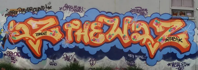
01IZ THE WIZ
NEW YORKSubway writing / name repetition
Michael Martin made his name central to New York’s subway-writing culture. Read the lettering first, then follow how colour and scale make it hold the wall.
Explore the writerA study of graffiti lettering
Learn the letters. Discover the writers.
Your A–Z of graffiti starts here.
THE A–Z LETTERING STUDIO
Learn the construction, one letter at a time. Choose a style, then work through four drawing stages.
Original practice example · uppercase Latin alphabet
01 / CHOOSE YOUR STYLE
02 / FOLLOW THE STAGES
Draw two sloping legs and a crossbar. Add equal thickness around the skeleton, keep the inner triangle open, then add colour. Enable JavaScript to explore the complete interactive A–Z.
These geometric examples teach basic construction; they do not reproduce an artist’s alphabet. Start on paper, then change proportions, spacing and curves to develop your own lettering.
01 / THE WRITERS
Start with an artist. Look at the structure, the rhythm and the space between the letters.
6 artist profiles
01Subway writing / name repetition
Michael Martin made his name central to New York’s subway-writing culture. Read the lettering first, then follow how colour and scale make it hold the wall.
Explore the writer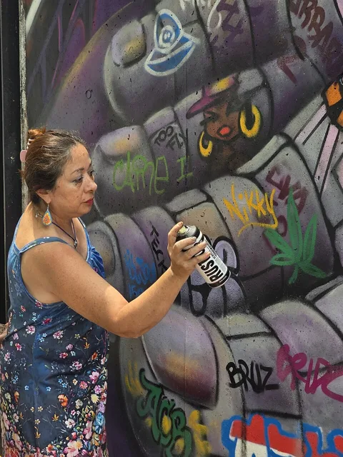 02
02Lettering / narrative murals
Beginning as a graffiti writer in 1979, Lady Pink brought a distinctive voice to subway painting and later mural work. Lettering sits alongside a much wider practice of storytelling.
Explore the writerBlock lettering / wildstyle
Clear letter construction and complex connections can coexist. Dondi’s influential writing is a starting point for studying how an outline keeps an elaborate piece readable.
Explore the writer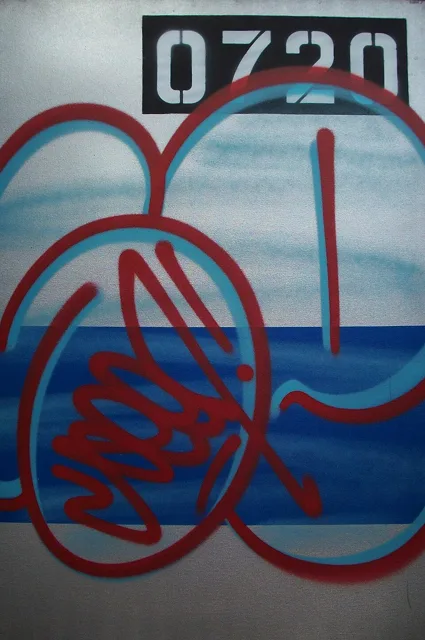 04
04Whole-car pieces / wildstyle
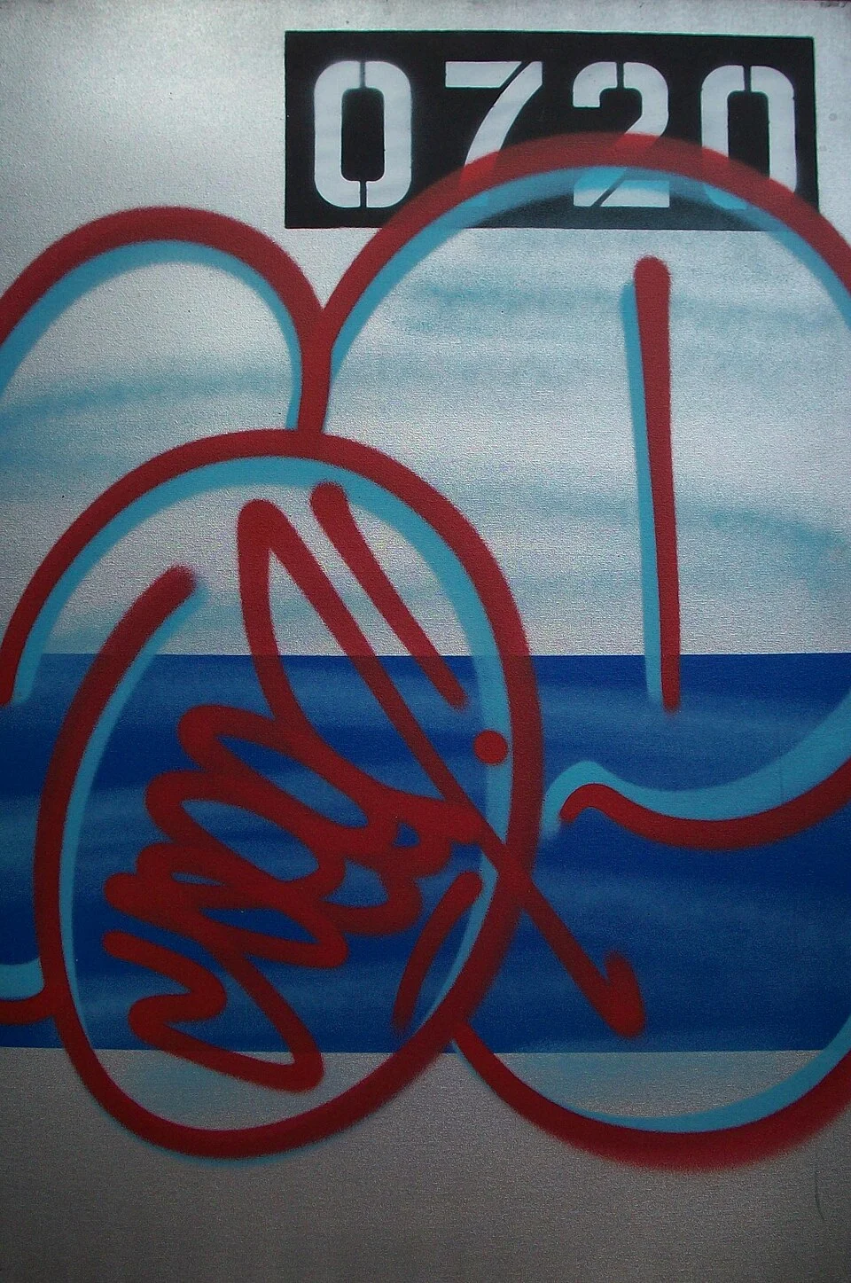
Seen’s work connects the impact of a name with the scale of a subway car. Study how outlines, fills and extensions organise a composition meant to be seen in motion.
Explore the writer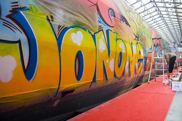 05
05Lettering / action painting
From New York subway writing to a Paris studio practice, JonOne connects the energy of a tag with layered, gestural painting. A name can become a rhythm across an entire surface.
Explore the writerAbstraction / gesture
What happens when the letter stops being the centre? Futura’s abstract approach expanded graffiti’s visual vocabulary through movement, line and open space.
Explore the writerNo writers match that search. Try another name or choose “All writers”.
A selected introduction, rather than a complete history. Artist index panels are typeset labels; photographs show real artworks or artists.
02 / THE VISUAL LANGUAGE
Styles overlap. These terms describe approaches to writing, rather than fixed boxes for individual artists.
The writer’s signature: a name shaped by the movement of the hand. Look for rhythm, stroke direction and a consistent relationship between letters.
Flow · stroke weight · personal rhythm
Rounded, simplified letter forms with an outline and often a limited fill. A throw-up is associated with speed; bubble lettering also appears in more developed pieces.
Soft shapes · compact spacing · repeated curves
Solid, readable letter construction. Strong proportions and controlled spacing give a name presence before extra connections, effects or decoration are introduced.
Legibility · proportion · clear silhouettes
Interlocking letters with extensions, connections and layered forms. Start by tracing one letter’s outline, then separate its structure from the surrounding flourishes.
Connections · extensions · overlapping forms
Depth can turn a letter into a sculptural object. Abstraction can move beyond a readable name altogether, letting gesture, colour and space carry the composition.
Perspective · shadow · movement · negative space
03 / A CLOSER LOOK
Trace the main stroke. Where does one letter finish and the next begin?
Look at the gaps as well as the forms. Repetition gives the whole name a pulse.
Distinguish the fill, outline, shadow and background. Each has a different job.
04 / ABOUT THE ARCHIVE
The Graphitti Archive is an independent introduction to the people and ideas behind graffiti lettering.
It begins with a selection of influential New York writers. Their approaches offer different ways to understand a name: as a signature, a composition, a symbol or a starting point for abstraction.
Profiles link to artist, museum and historical sources so you can continue exploring beyond this collection. The archive is not affiliated with the featured artists.
Sources & photo creditsPhotographs and sources
THE GRAPHITTI ARCHIVE / A–Z STUDIO
Original construction examples. Practise on paper and develop your own style.