Case study · Grid-navigation website
REDLINE — Independent Motorcycle Studio a website like no other.
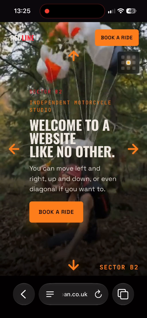
A website you move around like a map — swipe left, right, up, down or diagonally between full-screen film sectors, with a mini-map and “Book a ride”.
This is the real website. Scroll it, tap it, try it. On a phone it’s best full screen.
- Type
- Grid-navigation website
- Sector
- Automotive & adventure
- Sections
- 3
- Built with
- Hand-coded · no templates
About the site
REDLINE is an independent motorcycle studio with a website that breaks the usual rules. “Welcome to a website like no other. You can move left and right, up and down, or even diagonal if you want to.” Every screen is a full-screen film “sector” on a grid.
The idea
Instead of scrolling down a page, the visitor explores a 3 × 3 grid of film sectors — the arrows on every edge show which way you can go, and a mini-map in the corner shows where you are (here, Sector B2). It turns browsing into a ride.
What we built, section by section
- 01
Sector B2
The centre of the grid: “Welcome to a website like no other.”
- 02
Surrounding sectors
Eight more full-screen film scenes, reached by moving in any direction.
- 03
Book a ride
Always in the top corner and on every sector.
From the build
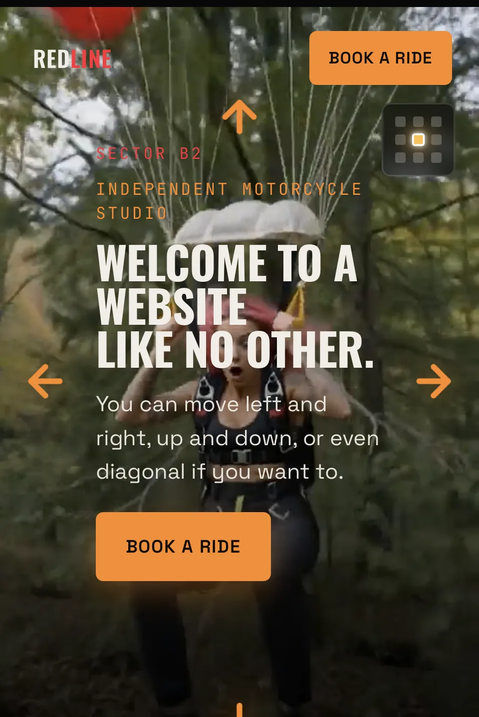
Films and pictures from inside the REDLINE — Independent Motorcycle Studio website. Swipe through.
Features
- Two-dimensional grid navigation (left, right, up, down, diagonal)
- Direction arrows on every edge
- Mini-map showing the current sector
- Full-screen film on every sector
- “Book a ride” on every screen
Look and feel
Raw outdoor film with orange and red accents, condensed bold headlines and a monospaced “sector” label — energetic and adventurous.
Under the bonnet
- Custom grid-navigation engine, hand-coded
- Swipe, arrow-key and tap controls
- Full-screen video per sector
Like everything I build, it’s made from scratch. No page builder, no theme. So it’s quick, it works on phones first, and it’s easy to change later.