Case study · Jewellery e-commerce concept
MERROW Paraíba tourmaline, worn after dark.
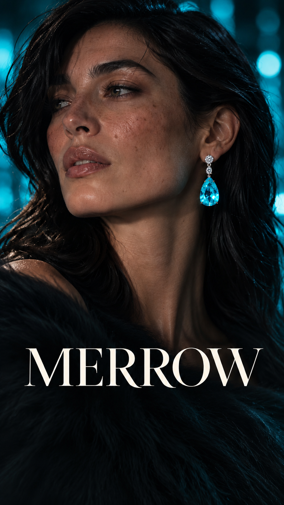
A concept jewellery shop for Paraíba tourmaline — a worn-versus-studio comparison slider, swipeable products and private viewings.
This is the real website. Scroll it, tap it, try it. On a phone it’s best full screen.
- Type
- Jewellery e-commerce concept
- Sector
- Luxury retail
- Sections
- 6
- Built with
- Hand-coded · no templates
About the site
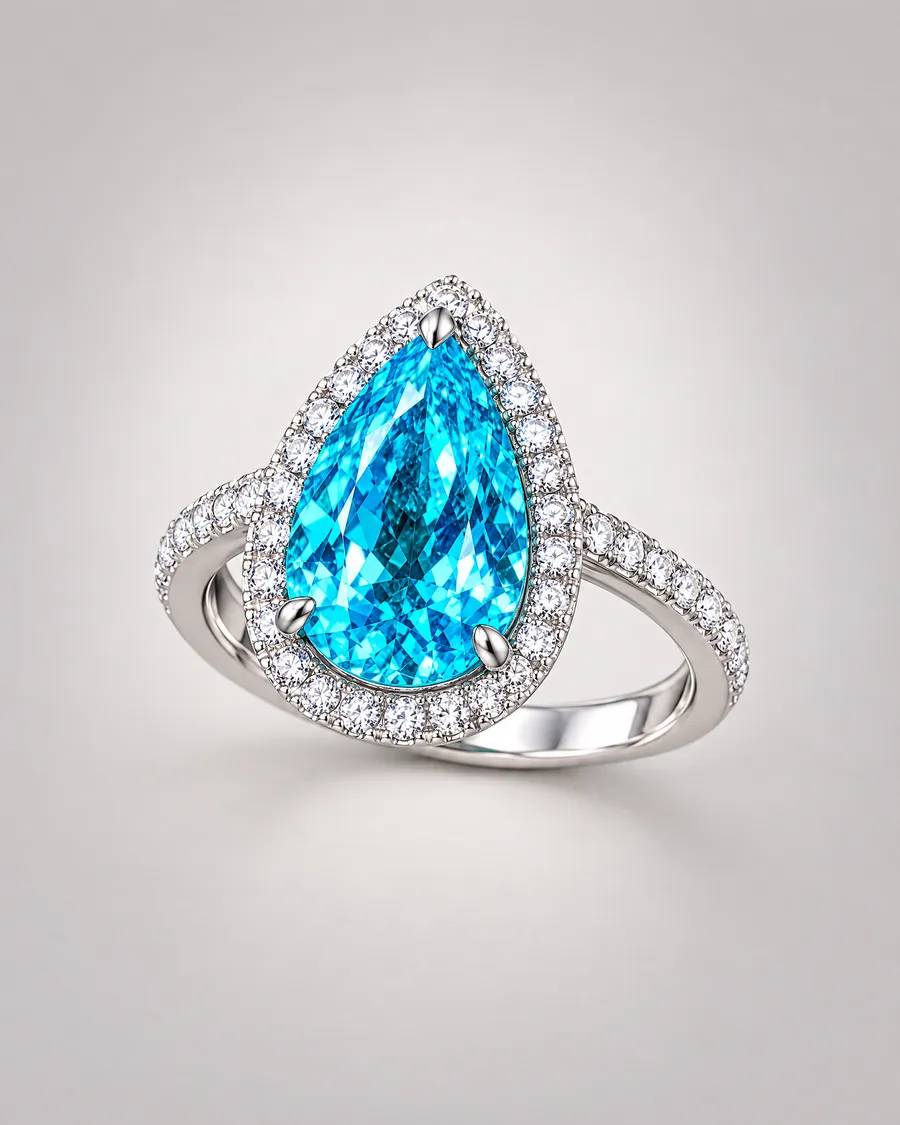
MERROW is a concept jewellery brand created for a design study: three Paraíba tourmaline pieces in 18-carat white gold, sold as the Night Swim collection. “Found in deep water. Worn after dark.”
The idea
Fine jewellery online usually means a white background and a zoom. MERROW shows every piece twice — worn at night, then bare in the studio — and lets the customer drag between the two. It answers the real question (what does it look like on?) before asking for the sale.
What we built, section by section
- 01
Found in deep water
The hero and “Shop the set”.
- 02
Three pieces. One night swim.
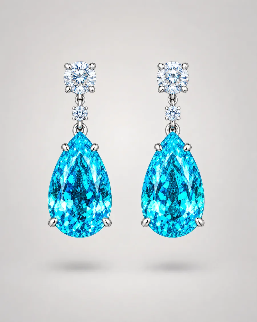
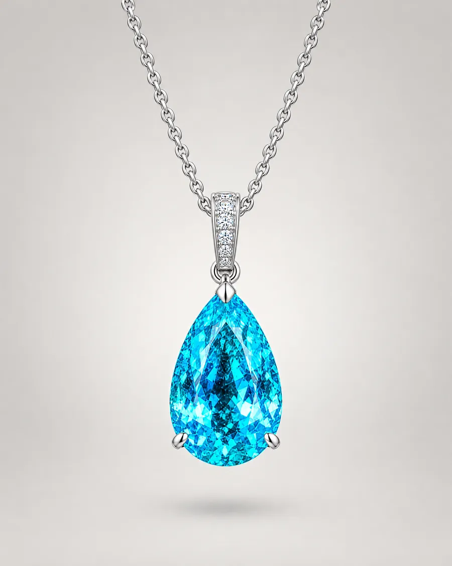
Riptide Drops, Low Tide Pendant and Moonpool Ring, each with specs and add-to-bag.
- 03
Two lights
Drag to compare each piece worn after dark and in the studio.
- 04
The Night Swim collection
Product cards with prices and a bundle offer for the set.
- 05
The atelier
The story of the stone, with three numbers — 18k, 41 hours of setting, 25 years of aftercare.
- 06
Private viewing
A one-field request to book an appointment.
From the build
Films and pictures from inside the MERROW website. Swipe through.

Features
- Worn / studio comparison slider
- Swipeable product row on phones
- Quantity steppers and add-to-bag
- Set bundle pricing
- Loader and scroll cues
- Private viewing request
Look and feel
Near-black, with the white gold and the electric pale blue of the stone as the only colour. Copy is poetic and rhythmic — short sea-and-night phrases — and the large headings lean on a single italic word.
Under the bonnet
- Hand-coded front end with custom slider and cart
- WebP product photography
- Canonical, Open Graph and Twitter tags
- Clearly marked as a fictional brand in the footer
Like everything I build, it’s made from scratch. No page builder, no theme. So it’s quick, it works on phones first, and it’s easy to change later.
Concept brand created for a design study.